PaperColor
- 4.5
- Rating
- 50.00M
- Installs
- Free
- Price
 Analysis by App-foxy
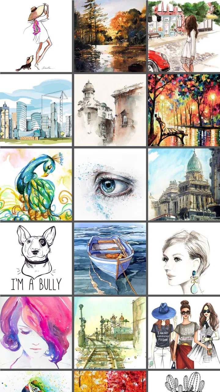
I like drawing apps that get out of the way quickly, and PaperColor mostly succeeds at that. It is a free art and design app from Eyewind that turns an Android phone or tablet into a compact sketchbook. The idea is straightforward: choose a brush, pick a color, and start painting without facing the dense interface of a professional desktop program. After using it, I see the app as a practical place for quick sketches, handwritten notes with a visual touch, color experiments, and casual painting rather than a complete studio replacement.
The first thing that stands out is its approachable feel. PaperColor imitates the familiar experience of working on paper, so the basic workflow is easy to understand even if you have never used a digital canvas before. It is listed in the Art & Design category, carries an Everyone age rating, and is free to install. That combination makes it especially suitable for beginners, younger users, and anyone who wants to try mobile drawing without committing to a complicated tool.
It has also built a sizeable audience, with an average rating of 4.4 from around 218 thousand ratings and more than 10 million installs. Those figures do not make it automatically perfect, but they do match my impression that PaperColor serves a broad audience well: people looking for a friendly sketching app rather than a highly technical illustration workstation.
You May Also Like

 AccuWeather: Weather Radar
AccuWeather Review: A Quick, Clear Forecast for Everyday Decisions
For everyday plans, the best forecast is the one you can understand quickly. AccuWeather makes rain timing, radar, and local conditions easy to act on, with a few trade-offs.

 Hill Climb Racing
Why Hill Climb Racing Still Turns Crashes Into One More Run
A tiny car, a bumpy hill and one more upgrade: Hill Climb Racing keeps resurfacing because its simple chaos makes every near-miss feel personal.

 AliExpress - Shopping App
AliExpress Makes Global Shopping Feel Personal, but Shoppers Bear the Risk
AliExpress turns a global marketplace into a pocket-sized discovery engine. Its reach is useful, its shopping loop compelling, and its trade-offs easy to miss.

 Lords Mobile: Kingdom Wars
Lords Mobile Is a Kingdom-Building Routine, Not a Quick Match
A case-by-case verdict on the building, battles, device demands, and social commitments that make Lords Mobile rewarding for some players and exhausting for others.

 PDF Scanner app - TapScanner
TapScanner Makes Paperwork Easier to Capture, Check, and Share
TapScanner makes scanning with a phone feel less like a rescue operation and more like a dependable step in getting work done. Its capture tools are useful, though not flawless.
 Block Blast!
 Shows How Much a Puzzle Game Can Leave Out
A quiet grid game shows why puzzle players increasingly value instant clarity, repeatable skill and low-pressure play—and where the genre still needs to catch up.
More From Our News Desk
View All News

A simple drawing routine that works well on a phone
My preferred way to use PaperColor is to begin with a very small goal. Instead of opening it expecting to produce a finished illustration, I use it for a thumbnail idea, a loose object study, a color arrangement, or a quick visual reminder. The app feels most comfortable in this role because the distance between opening the canvas and making the first mark is short.
A typical session starts with selecting a brush that matches the kind of mark I want. For a rough idea, I use a firm, uncomplicated stroke and avoid spending too long adjusting it. For a softer painting, I switch to a brush that lets the color blend into the paper-like surface more naturally. The important habit is to decide the purpose of the sketch first. If I am only planning a composition, I do not waste time trying to make every edge clean.
PaperColor is also useful for practicing hand control. On a small touchscreen, drawing long, confident lines is harder than on paper or with a large graphics tablet. I found that working with short strokes and building a shape gradually produces better results than attempting one perfect outline. This is a minor change in technique, but it makes the app feel much more predictable.
For a realistic everyday example, I might photograph a plant, open the app during a break, and make a loose study of its leaves. I can focus on the overall silhouette, test two or three greens, and save the result as a visual reference for a later painting. PaperColor is not trying to replace the camera or a full illustration suite in that situation. It is simply a fast bridge between noticing something and recording it creatively.
The paper imitation is helpful because it encourages a less technical mindset. Some digital art programs make every action feel like a decision about layers, masks, tools, and file management. Here, I can concentrate on the mark itself. That simplicity is one of the app’s strongest qualities, especially for children, casual hobbyists, and people returning to drawing after a long break.
How I set up a useful first sketch
I recommend starting with a light structure rather than immediately filling the canvas with color. I make a loose outline, place the largest shapes, and only then add stronger strokes. This gives me room to correct proportions before details take over. It also suits the phone format, where small decorative marks can quickly become visual clutter.
Color selection deserves the same restraint. I usually begin with a limited palette of a few related colors instead of choosing a new shade for every area. A restricted palette makes a simple sketch look more intentional and makes it easier to see whether the composition works. If the result feels flat, I add a darker accent or a lighter highlight rather than changing every color at once.
One useful habit is to pause before undoing a mark. On a touchscreen, a stroke that looks wrong in isolation may help balance the drawing once other shapes are added. I try to assess the whole image before removing anything. This matters in PaperColor because its appeal is partly the visible, hand-made character of the brushwork; over-correcting can make a casual painting feel stiff.
The app’s free entry point is another reason this workflow makes sense. You can test whether mobile drawing suits you before spending money. In-app purchases range from $0.99 to $27.99 per item, so I would first learn the basic tools and decide whether they fit your routine. There is no reason to buy extras simply because they are available if your main use is occasional sketching.
Settings worth checking before building a habit
PaperColor is easy to start using, but experienced users benefit from slowing down for a minute and checking the available controls. I pay attention to brush size, opacity, and color behavior before beginning a serious sketch. These settings affect the character of every mark, and changing them repeatedly in the middle of a drawing can interrupt the flow.
A large brush is useful for blocking in broad areas, but it can make small screens feel cramped when you move to details. I prefer to use a broad stroke only for the first shapes, then reduce the size for edges and accents. This simple sequence gives the image a clearer visual hierarchy: large decisions first, small decisions later.
Opacity is worth treating as a drawing tool rather than just a correction setting. A lower-opacity stroke can establish a guide without competing with the final lines. It is also useful for building tone gradually. Instead of choosing an extremely dark color immediately, I can layer a lighter mark and stop when the value feels right. This approach is more forgiving when sketching faces, leaves, fabric, or other subjects where soft transitions matter.
I also check how the canvas responds to my finger or stylus before committing to a detailed piece. A stylus can make line placement more comfortable, but PaperColor should be judged by the device you actually plan to use. A phone with a narrow screen is convenient for quick work, while a larger tablet gives the hand more room and makes broad strokes easier to control. The app remains approachable on both, but the experience is not identical.
One practical setting-related tip is to keep the tool arrangement consistent. When I repeatedly move controls around mentally or switch between unrelated brush choices, I lose time searching instead of drawing. I try to use a small personal set: one sketch brush, one filling or painting brush, and one detail brush. Even if the app offers more variety, limiting my working choices helps me develop a repeatable rhythm.
Before closing a session, I make sure the image is saved in the way I expect. This sounds obvious, but it is easy to finish a quick sketch and assume it is safely stored without checking the app’s saving behavior. For anything important, I avoid treating the canvas as the only copy. A drawing that represents a design idea, school project, or personal reference deserves an additional backup outside the immediate session.
Faster patterns for repeatable results
The best speed improvement I found is not a secret shortcut; it is reducing unnecessary decisions. I decide the canvas purpose, brush family, and rough palette before drawing. That preparation takes less time than constantly stopping to experiment, and it makes PaperColor feel much faster during short sessions.
For quick concept work, I use a three-pass pattern. First, I place the main silhouette with a broad or confident stroke. Second, I add the most important internal shapes. Third, I reserve a few minutes for contrast and cleanup. This prevents me from polishing an unconvincing outline. If the silhouette is wrong, detail will not rescue it.
For color studies, I work from light to dark. I establish a pale base, add a middle value, and finish with a small amount of the deepest tone. This is particularly effective when the app’s brush texture is part of the look. Starting with the darkest color can make the painting heavy, while a gradual build preserves a more natural paper-and-pigment impression.
Another efficient pattern is to create variations rather than repeatedly repainting one uncertain version. If I am deciding between two background colors or two compositions, I make a simple version of each. Comparing separate attempts is often clearer than endlessly modifying one canvas and forgetting what worked in the first place.
I also recommend naming or organizing finished work outside the drawing session when the project matters. PaperColor is excellent for making an image, but a personal archive is easier to manage when sketches are grouped by subject or purpose. I might separate practice drawings from ideas for a larger project, so a useful thumbnail does not disappear among casual experiments.
For handwriting and visual notes, I keep the brush fairly controlled and leave more empty space than I would in a painting. This makes the result easier to read on a small display. PaperColor can be a pleasant alternative to a plain notes app when the information benefits from arrows, little diagrams, or expressive lettering, but it is not the right choice for text-heavy documents that need search, formatting, or easy editing.
Where the app begins to feel limited
PaperColor’s simplicity is also its main trade-off. If your work depends on a deep layer system, precise vector shapes, advanced selection tools, complex typography, or highly controlled export options, you will probably outgrow it. A professional illustration app or a dedicated tablet program will offer more control for finished commercial artwork.
I would also hesitate to choose it for projects that require exact repetition. When a design needs identical spacing, perfectly aligned geometry, or a reliable series of revisions, freehand painting is not the most efficient method. PaperColor is better at expressive marks than technical drafting. For diagrams, interface mockups, logos, and measured layouts, a vector or design-focused alternative is usually a better fit.
The phone itself can become the limiting factor. Fine details are harder to judge on a small screen, and a finger can cover the area being drawn. A larger tablet and a suitable stylus improve comfort, but they do not transform PaperColor into a full professional workstation. I see the app as a flexible sketchbook whose quality depends heavily on the screen and input method available.
There is also a creative limitation that is easy to overlook: a brush-based app encourages you to think in strokes. That is wonderful for painting and loose illustration, but less convenient when you need to rearrange individual objects or revise a composition structurally. If you often change your mind about where an element belongs, a tool designed around editable objects may save more time.
The optional purchases deserve a measured approach as well. The app is free, but the presence of items priced from $0.99 to $27.99 means the complete experience may involve spending depending on what you want to unlock. I would use the free version long enough to identify a real limitation in my own workflow before paying. That keeps the decision practical rather than impulsive.
Who should use it, and who should choose something else?
I would recommend PaperColor to a beginner who wants a gentle introduction to digital painting, a student making visual notes, a parent looking for an accessible creative app, or an experienced artist who needs a quick idea pad. It is especially appealing if you value immediate brush feedback more than a large collection of technical controls.
It is also a good companion for people who already draw on paper. The familiar brush-and-canvas approach can make the move to a touchscreen less intimidating. You can practice shapes, color relationships, and composition without buying art materials, while still keeping the loose quality that makes traditional sketching enjoyable.
I would point more demanding users elsewhere if their main goal is polished production work. Digital painters who need extensive editing, designers working with exact shapes, comic artists managing complex pages, and professionals who depend on robust file organization should look for a more specialized application. PaperColor can still be useful for rough planning, but it should not be mistaken for the final tool.
The current version is 2.9.15, and the app supports devices running Android 5.0 or later. That broad compatibility helps explain why it can serve older phones and tablets, although performance and comfort will naturally vary by hardware. If your device has limited screen space, test a short sketch before planning a detailed project; the app may run comfortably while still feeling physically cramped.
My verdict after making it part of a drawing routine
PaperColor is at its best when you use it as a fast, forgiving sketchbook rather than demanding a complete digital art studio. I like its low barrier to entry, its paper-inspired character, and the way it encourages me to make a mark before overthinking the setup. The strongest results come from repeatable habits: choose a limited brush set, block in large shapes, build color gradually, and save important work carefully.
Its limitations are clear, but they are not necessarily flaws for the audience it serves. The lack of professional-level control can feel restrictive when a project becomes complex, yet that same restraint keeps a beginner from being buried under panels and technical choices. I would not use it for precision design or a major finished commission, but I would happily open it for a five-minute study, a color test, or a visual note.
Eyewind has made an app that is easy to recommend to someone who wants to draw immediately and learn by doing. With an Everyone rating and a free starting point, it is approachable for a wide range of users. Just keep expectations realistic: the value is in quick, tactile creativity, not in replacing every specialized art tool. For that purpose, PaperColor remains a useful and pleasant choice.
FAQs for PaperColor
01What is PaperColor and how does it work?
PaperColor is a digital drawing app designed to mimic the experience of painting with real brushes and paper. It offers a variety of brushes, textures, and tools that cater to both beginners and professional artists. The intuitive interface makes it easy to navigate through features such as layering, color blending, and customizable brush settings.
02Is PaperColor suitable for beginners who are new to digital art?
Yes, PaperColor is highly suitable for beginners. The app offers a user-friendly interface with simple tutorials and guides to help new users get started. It provides basic tools for beginners while also offering advanced features for more experienced artists, making it versatile for all skill levels.
03What features make PaperColor stand out from other drawing apps?
PaperColor stands out due to its realistic brush effects and textures that simulate traditional painting. It offers a wide range of brush types, customizable tools, and a layering system that allows for complex creations. The app also provides a unique color blending feature and an easy-to-use interface, enhancing the overall user experience.
04Is PaperColor available on both Android and iOS devices?
Yes, PaperColor is available for download on both Android and iOS platforms. Users can find it on the Google Play Store and Apple App Store, ensuring compatibility with a wide range of devices. Regular updates are provided to enhance functionality and add new features across both operating systems.
05Does PaperColor require any in-app purchases or subscriptions?
PaperColor offers a free version with basic tools and features. However, for access to the full range of advanced brushes, textures, and additional features, users can opt for in-app purchases or a subscription model. This allows users to tailor their experience based on their specific needs and budget.
Pros
- Intuitive interface for easy drawing.
- Wide range of brushes and tools.
- Realistic color blending effects.
- Supports high-resolution exports.
- Offline mode available.
Cons
- Limited free version features.
- Occasional lag on older devices.
- No cloud sync for projects.
- Ads in the free version.
- Limited layer functionality.

PaperColor
Gallery